Table of Contents
Training Video
WordPress Basics
The WordPress Dashboard & Left Hand Menu
Toggling Between the Frontend & Backend of the Website
Media
Content
Custom Blocks
Custom Post Types
View the Full Training Video
Site Access
In the future you may need to grant permissions to others or adjust who can access different parts of your site. Here’s how you can manage user accounts and control site access:
Adding a New User
- Go to “Users” > “Add New.”
- Fill in the user information, including username, email, first name, last name, and password.
- Choose the appropriate role for the user (e.g., Administrator, Editor, Author, Contributor, Subscriber).
- Click “Add New User.”
Editing an Existing User
- Go to “Users” > “All Users.”
- Click on the username of the user you want to edit.
- Make the necessary changes, such as updating the email, changing the role, or resetting the password.
- Click “Update User.”
Deleting a User
- Go to “Users” > “All Users.”
- Hover over the username of the user you want to delete and click “Delete.”
- You will be prompted to reassign or delete the content created by this user. Choose the appropriate option and confirm the deletion.
User Roles and Permissions
Understanding user roles is crucial for managing site access effectively. Here are the default WordPress user roles and their capabilities:
Subscriber: Can manage their own profile and view content. Suitable for membership or subscription-based sites.
Administrator: Full access to all site features, including theme and plugin management, user management, and content creation/editing.
Editor: Can publish and manage posts, pages, and other content types created by any user.
Author: Can publish and manage their own posts.
Contributor: Can write and manage their own posts but cannot publish them. Posts must be approved by an Editor or Administrator.
Logging into WordPress
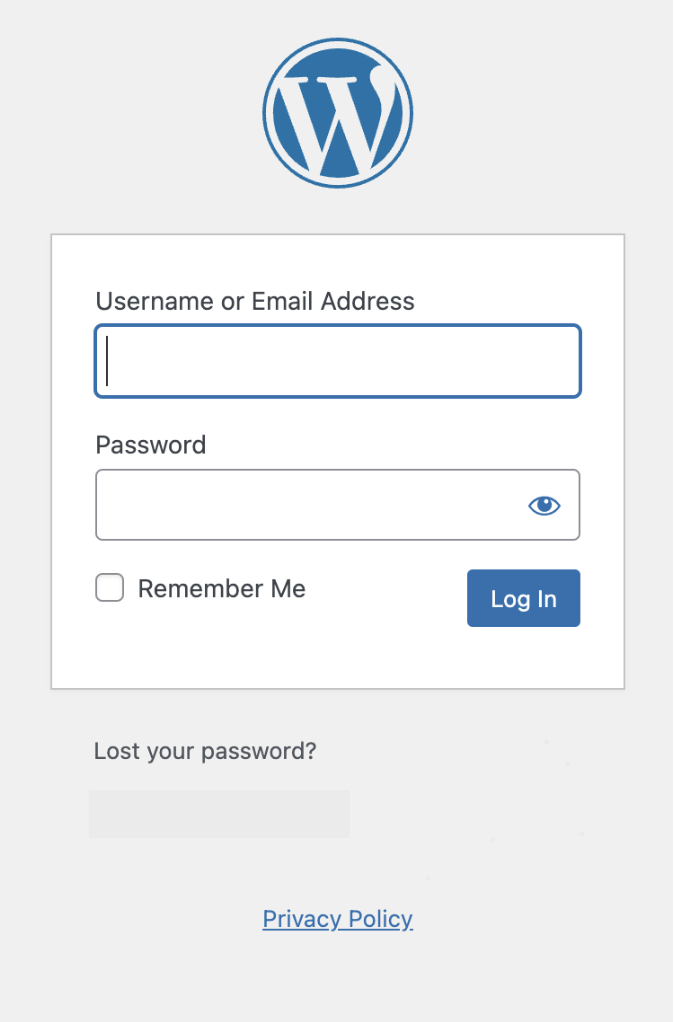
Go to https://www.sportsmedcenter.ca/login
Enter your login credentials provided by the administrator.
Once logged in, you’ll be directed to the WordPress dashboard.
If you forget your password in the future, you can use the “Lost your password?” functionality below the login.
The WordPress Dashboard & Left Hand Menu
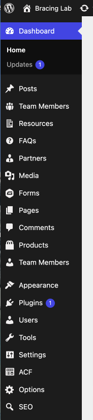
Once logged in, you will land on the Dashboard Screen. From here you can see many options in your menu along the left side. The main area that you will use to edit is:
Toggling between the Frontend & Backend of the Website
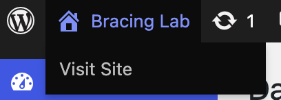
When you are in the backend, click on the house icon on the top left of your screen to toggle between the backend and frontend.
This helps in quickly locating and editing specific pages.
Media Overview
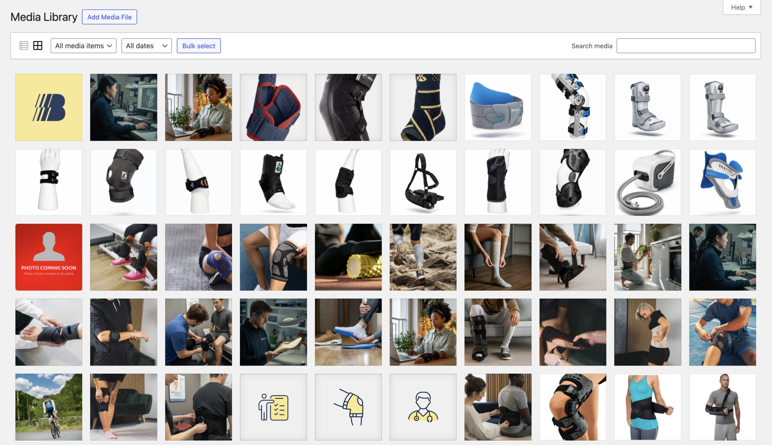
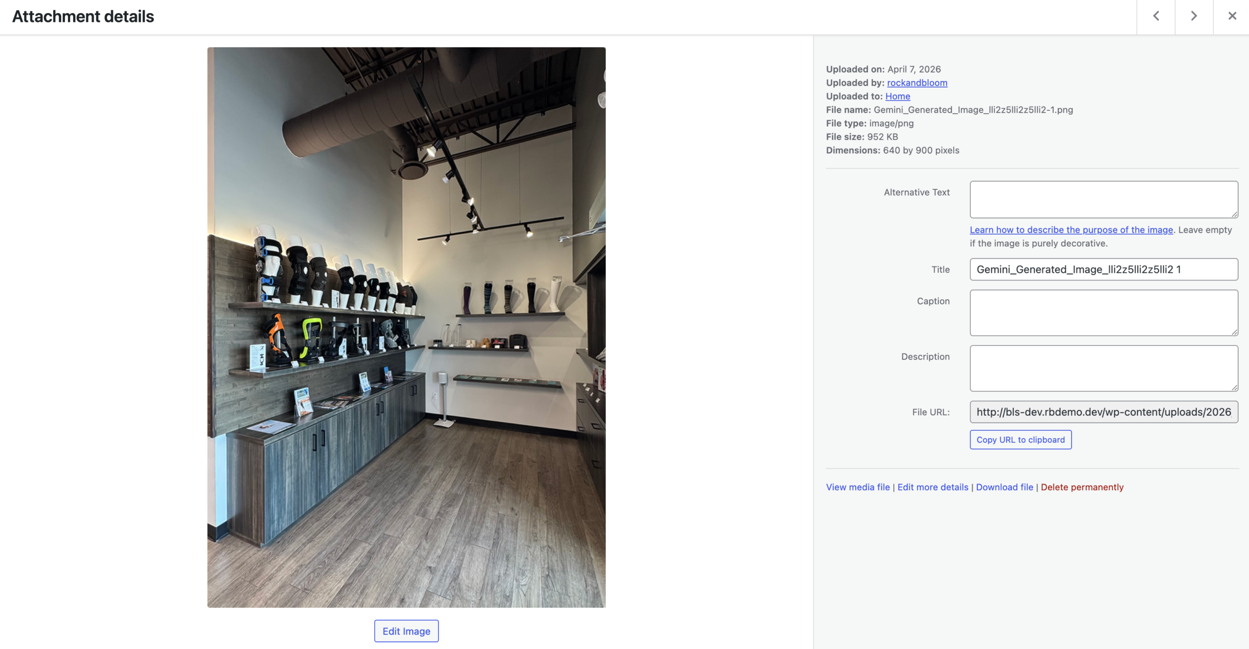
The Media Library contains all of the images, videos, logos and PDFs that are on your site. As there is quite a lot of media on your site, it has been divided into categories to make them more accessible.
Adding New Images & Videos
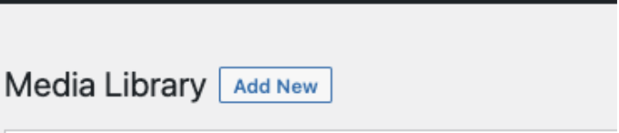
On the top of the Media Library, click on Add New. Then select the image or video that you want to upload.
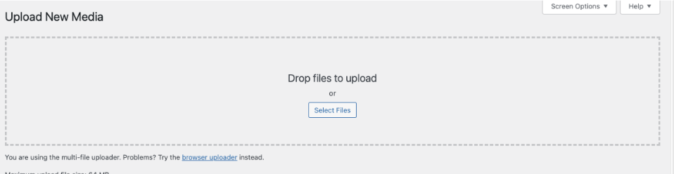
The Upload option will open up and you can select or drag and drop images from your computer here.
Replacing Existing Images
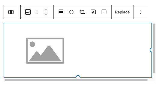
Hovering over the image will show the formatting options.
Clicking on the “x” will remove the image. The “Pencil” helps you to edit the existing image.
After removing the image, you can add a new one by clicking on “Add Image”
Add Image: Clicking here opens up the The Media Library.
The Media Library tab shows the images that are already on the website.
To add a new image you would click on the “Upload Files”
You can drag and drop or select files from your computer to upload.
Add Image: Clicking here opens up the The Media Library.
The Media Library tab shows the images that are already on the website.
To add a new image you would click on the “Upload Files”
You can drag and drop or select files from your computer to upload.
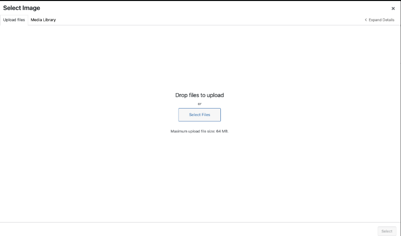
Image Sizes
Recommended Pixel Sizes
Feature image sizes (landscape 1200 x 900 pixels)
Feature image sizes (portrait 900 x 1200 pixels)
Background image size (1920 x 1080 pixels)
Logo image size (200 x 100 pixels)
Thumbnail image size (150 x 150 pixels)
Image Formats
JPEG or PNG
Image File Size
Optimize every JPEG and PNG before uploading to improve website performance. Compressing images enhances speed without sacrificing quality. Use squoosh.app for effective compression without resizing images.
Editing Content
Most of the content on this site is in the form of paragraphs. In some cases, certain words have web links added to them. These links can take you to pages within the site or an external site.
Saving all edits:
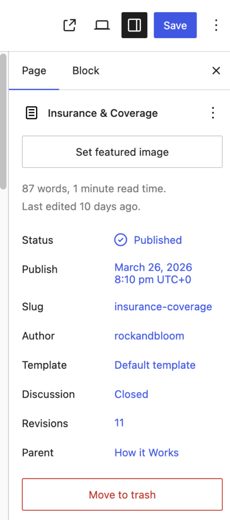
All page edits must be saved by clicking on the “Save/Update” Button on the top right of the screen
Formatting Text
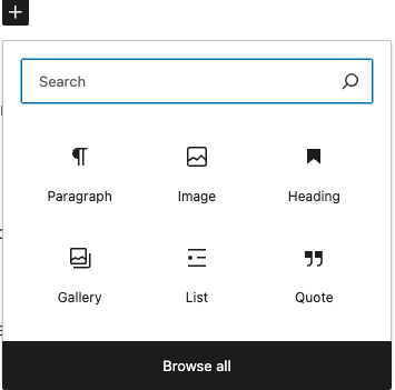
To make your content more engaging and easier to read, you can format your text in various ways:
- Bold: Highlight text and click the “B” button.
- Italic: Highlight text and click the “I” button.
- Headings: Use headings to organize content. Select the text and choose the appropriate heading level from the drop-down menu in the editor.
- Lists: Create bullet points or numbered lists by clicking the respective buttons.
You can also add links to your content that would link to another page on your site (and internal link) or link to a different website (an “external link”)
To add a link to a certain word or phrase:
- highlight the word or phrase you would like to add a link to.
- Click on the “chain link” icon.
- Paste in or search for the link that you would like to add.
- Click on the link and press Enter.
- To add an external link, follow the same steps as above, except after adding the link, make sure the “Open in new tab” option is selected.

Schedule Post
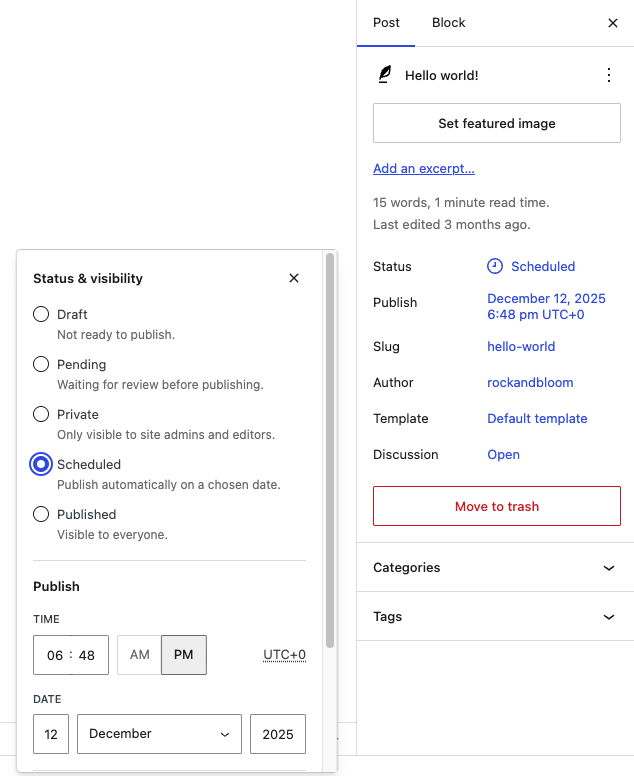
To schedule a post:
- Go to the Publish section on the right sidebar.
- Click the current publish value. The image, the value is Immediately.
- Set the date and time the post should be published on.
- Select the Schedule button that appeared on the top bar.

Options
To edit key global content areas on the website (such as the 404 page, team archive page banner, resource archive page banner), go to Options in the left sidebar.
- Edit the Social, Location, Contact
- Edit the Team – Archive Page
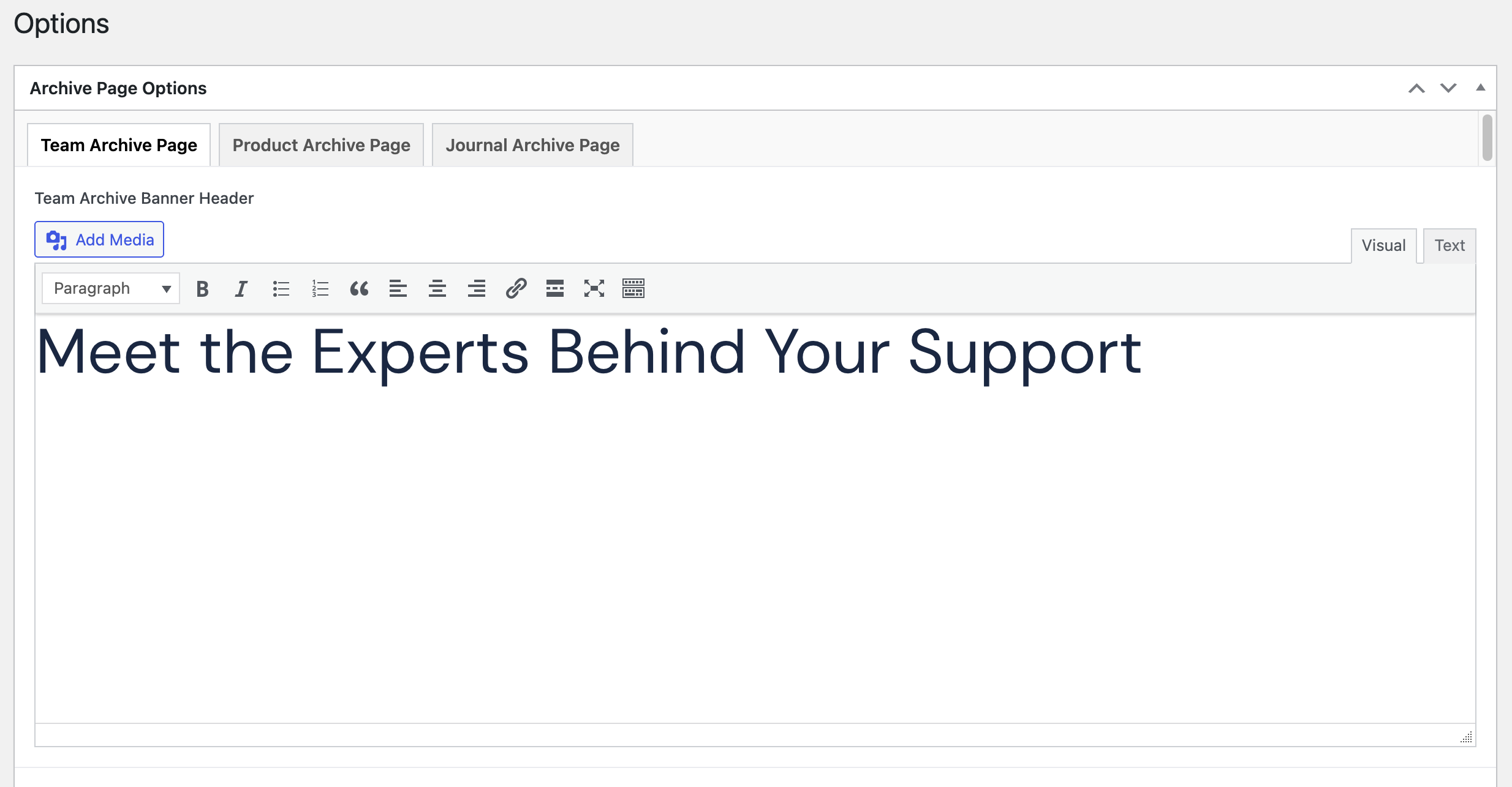
- Update the banner content for the Team Archive Page
- Edit the Product – Archive Page
- Update the banner content for the Product Archive Page
- Edit the Journal – Archive Page
- Update the banner content for the Journal Archive Page


Group
Group sections and content together with the group block. It adds padding to the top and bottom of the section and centres the content on the page.
The option follow:
- Default: no styling or background color
- Offwhite Background
- Offwhite Pattern Background
- Dark Background
- Dark Pattern Background
- Narrow: Needs to be nested inside a Default or Coloured Group to be centred on the page with padding. Makes content width narrow; Does NOT centre content or add padding to the top/bottom.
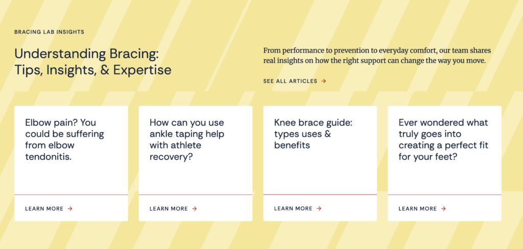

Columns
Use the Columns block to display content side by side. This is a core WordPress block with no custom styles applied.
You can place most blocks inside each column, including text, images, buttons, and even the Card block.
A few things to keep in mind:
- Columns should be placed inside a Group block so that the content is properly centred on the page with consistent padding.
- You can adjust the number of columns and their width ratios from the block settings in the sidebar.
- On mobile, columns will automatically stack vertically.

Buttons
Add clickable buttons to your page using the Buttons block. We’ve set up three custom button styles to keep things consistent across the site.
The style options are:
- Primary: The main call-to-action button. Use this when you want something to stand out and grab attention.
- Secondary: A supporting button with less visual weight than the Primary. Use this when you have a second action alongside a Primary button, or when the action is important but not the main focus of the section.
- Text Link: A minimal button styled to look like a link with an arrow or indicator. Use this for softer actions where a full button would feel too heavy — things like “Read More” or “See Details.” Works well at the end of a content section as a subtle nudge.


Hero Banner
Block requires:
- Image Gallery:
- Select images from media
- Buttons:
- Add links to display under content
- Content: Edit in Preview Mode
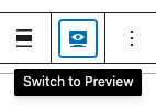
- Select the block and select the preview mode option shown above the block
Do NOT include inside Group.


Subpage Banner
Block requires:
- Type:
- Blue Pattern
- Yellow Pattern
- Offwhite
- Content: Edit in Preview Mode
- Select the block and select the preview mode option shown above the block
Do NOT include inside Group.

Image with Steps
Block requires:
- Main Image
- Steps Type:
- List: Checkmarks
- Icon: Add icon images
- None: Just heading & content
- Repeater Fields
- Icon (if icon type)
- Heading
- Content
- Button
- Content: Edit in Preview Mode
- Select the block and select the preview mode option shown above the block
Do NOT include inside Group.


Row Content
Block requires:
- Repeater Field Rows (Right):
- Content
- Background Colour:
- White (default)
- Offwhite
- Offwhite with pattern
- Dark
- Dark with pattern
- Yellow with pattern
- Content (Left): Edit in Preview Mode
- Select the block and select the preview mode option shown above the block
Do NOT include inside Group.


Product Carousel


Journal 4Up
Block requires:
- Type:
- Category (4 max):
- Choose Journal category
- Select (4 max):
- Choose from all published Journal posts
- Category (4 max):
DO use within Groups.

Image Grid & Content
Block requires:
- Images (3)
- Content: Edit in Preview Mode
- Select the block and select the preview mode option shown above the block
Do NOT include inside Group.

Image Gallery


FAQs
Block requires:
- Type:
- Category: Display FAQ items from a single category
- Select: Display selected FAQs from a list
- Content: Edit in Preview Mode
- Select the block and select the preview mode option shown above the block
Do NOT include inside Group.

CTA
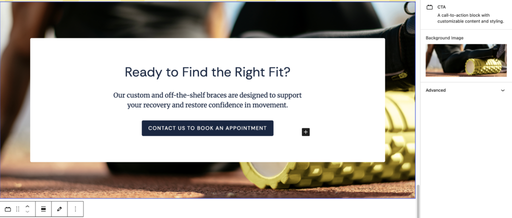
Block requires:
- Image
- Content: Edit in Preview Mode
- Select the block and select the preview mode option shown above the block
Do NOT include inside Group.
Partners List
Block requires:
- Partners:
- Selected from Partners CPT
- Content: Edit in Preview Mode
- Select the block and select the preview mode option shown above the block
Do NOT include inside Group.

Resource Columns
Block requires:
- Section Heading (H2 recommended for first heading)
- Column Heading (2 columns total)
- Repeater Fields:
- Type: Link or File
- Content: Edit in Preview Mode
- Select the block and select the preview mode option shown above the block
Do NOT include inside Group.


Text with Background
Block requires:
- Content: Edit in Preview Mode
- Select the block and select the preview mode option shown above the block

Fun Facts

Protocols
Block requires:
- Protocols:
- Select protocols from list of CPT: Protocol items
Do NOT include inside Group.
Use ONLY on Team Member CPT pages.

Contact & Location
Location info comes from Options

CPT: Journal (Posts)
Required fields:
- Title
- Content
- Category

CPT: Team Members
To create a new post, select Add New Team Member.
Required fields:
- Title: the Team Member’s name
- Image
- Credentials
- Position
- Phone Number
- Fax Number
- Location
- Google Map URL
Bio content is added under the title in the general content area. Fun Fact block & Protocols block can be used on single team pages.
CPT: Resources
Required fields:
- File
- Category

CPT: Products
Required fields:
- Title
- Featured Image (main product photo)
- Image Gallery (additional product photos)
- Description
- Price
- Details
- Repeater Fields:
- Download Links
- Category

CPT: FAQs
Required fields:
- Title
- Content
- Category

CPT: Partners
Required fields:
- Title
- Content
- Website URL
- Featured Image

Contact Us
Questions? We’re here to help! Reach out anytime if you need a hand.

Molly Lux
Account Manager/Director
molly@rockandbloom.com

Meg Wilken
Creative Operations
meg@rockandbloom.com